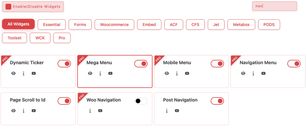
Essential Classy Tab from Dashboad -> Widgets then enable Mega Menu Widget
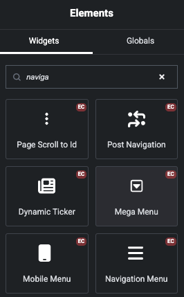
Now Drag and Drop Mega Menu widget
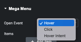
Manage Hover, Click or Hover Intent Event
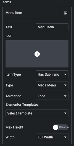
Mega Menu Repeater
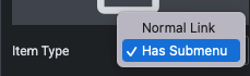
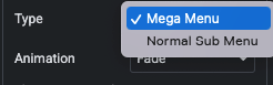
Manage Normal Menu or Sub Menu
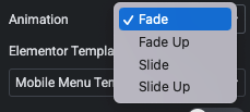
Manage Animation – Menu Wise
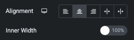
Manage Alignment
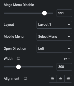
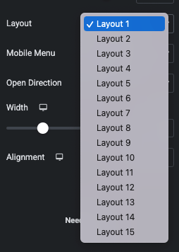
Manage Responsive VIew
15 Predefined Mobile Toggle Design
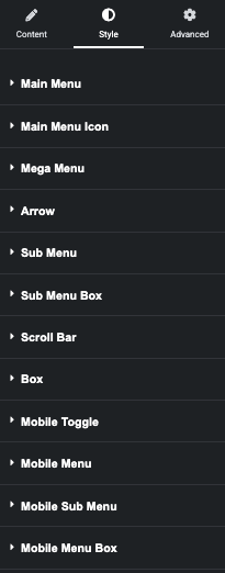
Mega Menu – Style Tab
Mega Menu – Styling Options Guide
Controls the main header menu links.
Layout & Spacing
Outer Gap – Space between menu items
Inner Gap (Menu & Arrow) – Space between text and arrow
Min Height / Min Width – Set minimum item size
Alignment – Left, Center, Right, Space Around, Space Between
Typography & Padding
Typography – Font, size, weight, spacing
Padding – Inner spacing of menu items
States
Normal – Text, background, border, shadow, transition, transform
Hover – Hover colors, border, shadow, transition, transform
2. Main Menu Icon
Controls icons inside menu items.
Margin – Space around the icon
Size – Icon or SVG size
Colors – Normal and hover colors
3. Mega Menu (Dropdown Container)
Controls the main dropdown panel.
Padding – Inner spacing
Background – Solid or gradient
Border & Radius – Shape styling
Box Shadow – Depth effect
4. Arrow (Dropdown Indicator)
Controls submenu arrow icons.
Size – Arrow dimensions
Left Offset – Space from text
Colors – Normal and hover
5. Sub Menu (Dropdown Links)
Controls submenu items.
Normal – Text, background, border, shadow, transition
Hover – Hover colors, border, shadow, transition
6. Sub Menu Box (Wrapper)
Controls the submenu container.
Min Width – Dropdown width
Text Alignment – Left, Center, Right
Normal – Background, border, shadow
Hover – Hover background, border, shadow
7. Scroll Bar (Mega Menu Scroll)
Shown when content overflows.
Scrollbar – Background, width
Thumb – Background, radius, shadow
Track – Background, radius, shadow
8. Box (Main Menu Wrapper)
Controls the full menu container.
Padding – Outer spacing
Pro Tips 💡
Use smooth transitions (all 0.25s ease-in-out)
all 0.25s ease-in-out
Avoid heavy transforms on mobile
Prefer padding over fixed heights
Combine border radius + shadow for modern UI