Table of Content Widget Tutorial
Essential Classy Tab from Dashboad -> Widgets then enable Table of Contents

Now Drag and Drop Table of Contents widget
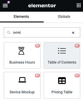
Table of Contents
You’ll need a contentSelector that targets the container with the content you want to generate a TOC from. It could be something like #article or .blog-post.
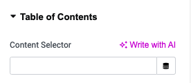
Select Tag
The Select Tag allows you to target specific heading levels (e.g. h1,h2, etc.) in your document for creating a Table of Contents (TOC). This gives you flexibility in choosing which headings to include in the TOC.

Heading Active Offset
The Heading Active Offset is useful when you want to adjust the position of headings relative to the viewport when scrolling. This is often necessary when you have a fixed header (e.g., a sticky navigation bar), as the heading can be obscured when the page scrolls to that section.
The Heading Active Offset will apply a scroll offset so that the heading is positioned correctly, ensuring that it’s not hidden under a sticky header or other elements.

Collapsed Sub

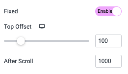
Fixed
Using Top Offset, You can manage gap from Top.
And in After Scroll, You can manage TOC Fixed after offset of Scroll.
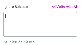
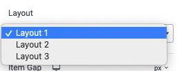
Layout
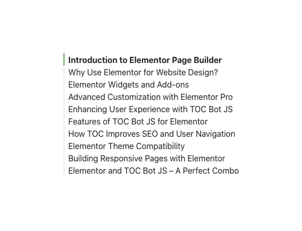
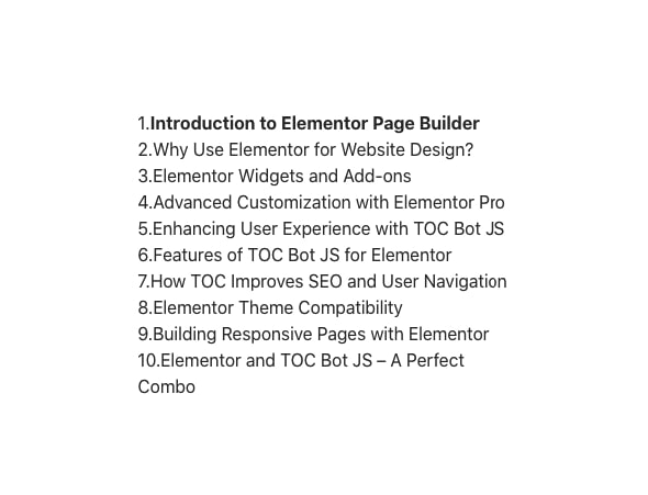
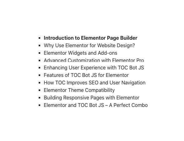
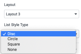
Layout 3 – List Style Type
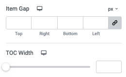
Using Item Gap, You can manage Gap Between Heading.
Style Tab
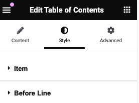
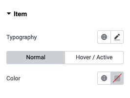
Item – Style
In this tab, You can manage Typography of Heading.
Also, You can manage color for Normal, Hover and Active State of Item.
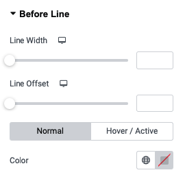
Before Line – Layout 1
In this tab, You can manage Line Width and Line Offset.
Also, You can manage color for Normal, Hover and Active State of Before Line.
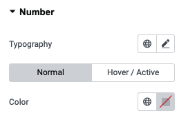
Number – Layout 2
In this tab, You can manage Typography of Number.
Also, You can manage color for Normal, Hover and Active State of Number.
Dots – Layout 3
In this tab, You can manage Color of Dots.
