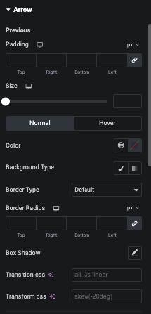
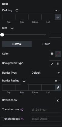
In this tab, You can manage Image Transition and Transfor for Normal and Hover State of Image.
In this tab, You can manage Image Size, Repeate and It’s Position with Overlay Color for Nomal and Hover state.
In this tab, You can manage Text and Content Alignment, Padding, Margin and Typography of Title.
Also, You can manage Color, Background, Border and Shadow for Normal and Hover State of Title.
In this tab, You can manage Text Alignment and Content Alignment, Padding, Margin and Typography of Description.
Also, You can manage Color, Background, Border and Shadow for Normal and Hover State of Description.
In this Meta tab, You can manage Padding, Margin and Typography of Meta.
Also, You can manage Color, Background, Border, Shadow, Transition and Transform for Normal and Hover state of Meta.
In this tab, You can manage Alignment of Price, Margin, Typography and Manage color of Price for Normal and Hover state.
In this tab, You can manage Typography and Color for Previous Price.
In this Rating tab, You can manage Alignment of Size of Rating.
Also, You can manage Fill and Empty color for Normal and Hover State.
In this tab, You can manage Alignment, Padding, Margin and Typography.
Also, You can manage Color, Background, Border and Shadow for Normal, Hover and Box Hover state of Add to Cart button.
In this tab, You can manage Text Alignment, Margin and Typography of Out of Stock Text.
Also, You can manage Color for Noemal and Hover State of Out of Stock.
In this tab, You can manage Margin, Width/Height and It’s Typography.
Also, You can manage Color, Background, Border, Shadow, Transition and Transform for Normal and Hover State of Sale Badge.
In this tab, You can manage No Product Text, Alignment, Typography, Color, Background, Border and Shadow.
In this tab, You can manage Padding of Inner Box.
Also, You can manage Background, Border and Shdow for Normal and Hover State.
In this tab, You can manage Background, Border and Shdow of Box.


