Popup/Offcanvas Widget Tutorial
Essential Classy Tab from Dashboad -> Widgets then enable Popup/Offcanvas

Now Drag and Drop Popup/Offcanvas widget

Direction – We have Left, Right, Top and Bottom option for popup open.

In Button, We have Text and Icon optons

In Content Template, You can select Template and Manage Widgt/Height of Popup.

In Close Icon, We have Text and Icon optons

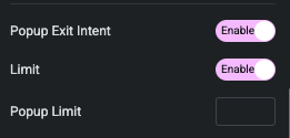
Exit Intent
An exit-intent popup is a website feature designed to detect when a user is about to leave the page, triggering a popup message to capture their attention and encourage engagement, such as subscribing, offering discounts, or highlighting important content.

Manage How many times, You want to show popup to user on Exit Intent.

Popup On page load
Appears immediately or after a short delay when a user first visits a page, typically used to grab attention for announcements or promotions.

Hide Button is used when you want popup for On Load or Exit Intent.
Style Tab
In Style tab, We have Button, Content, Close Button and Background Overlay options.

Button – Style Tab
In this tab, We have Padding, Width, Typography, SVG Icon Size and It’s Gap options.
Additionally, We have Color, Background, Border, Shadow, Transition and Transform CSS option for Normal and Hover State for Button.

Content – Style Tab
In this tab, We have Padding, Background, Border and Box Shadow options.

Close Button – Style Tab
In this tab, We have Top and Right offset options for Close Button.
Also, We have padding, Width, Typography, Icon Size and It’s Gap options.
Additionaly, We have Color, Background, Border, Shadow, Transition and Transform CSS for Normal and Hover State.

Background Overlay – Style Tab
In this tab, You can manage Overlay Color of Popup.
