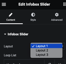
3 Predefined Layout
Selection of Icon / Image / Text
Titile with Tag option
Description in Editor
Button or Manage Box Link
Attractive Layout uisng Pin Text
Manage Height and Alignment
Slider Option
Slider Direction – Vertical/Horizontal
Slide to Show and Slide to Scroll Option
Slider Gap
Slider Dots
Slider Arrow
Slider Infinite Mode and Animation
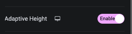
Slider Adaptive Height
Slider Autoplay and It’s Speed
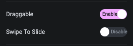
Slider Dragable
Slider Pause on Hover, Center Mode and On Mouse Wheel Scroll option
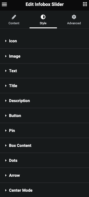
Style Tab
Dots Tab
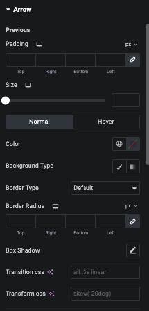
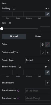
Arrow tabs
Center Mode
Icon
In this tab you can manage Padding, Margin and Size of Icon.
And for Normal and Hover, You can manage Color, Background, Border and Box Shadow.
Title
In this tab you can manage Padding, Margin and Typography.
And for Normal and Hover, You can manage Color, Background, Border, Box Shadow and Text Shadow.
Description
In this tab you can manage Padding, Margin, Typography and Alignment.
Button
Pin
In this tab you can manage Padding, Typography, Top & Right Offset.
Box Hover Direction


