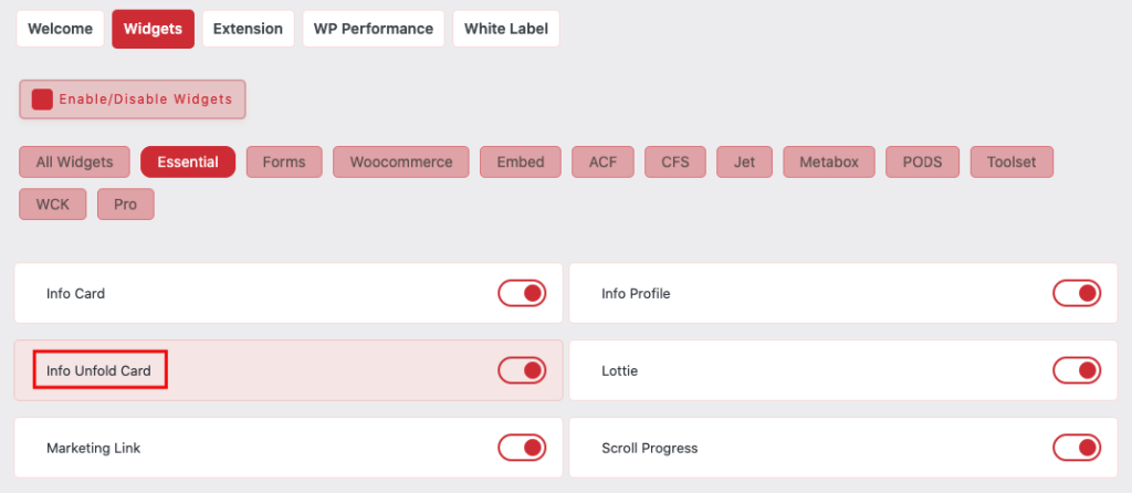
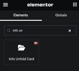
Now Drag and Drop Info Unfold Card widget
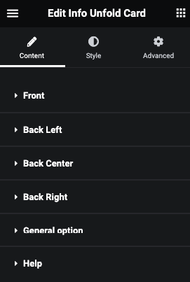
Info Unfold Card Content
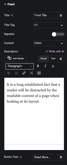
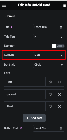
Front Content
Content with Editor or Lists option in All Cards
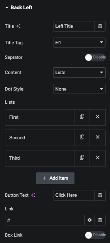
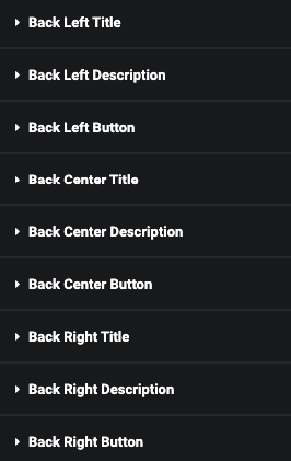
Back Left Content
Back Center Content
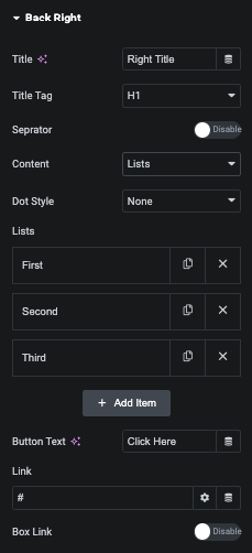
Back Right Content
General Option
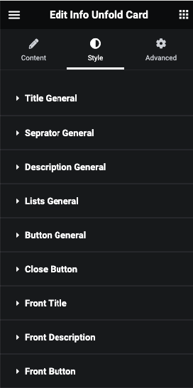
Info Unfold Card Style
Title General Style
In Title General tab, You can manage Padding, Margin and It’s Typography.
Also, Manage Color, Background, Border, Box Shadow, Text Shadow, Text Stroke, Transition and Transform CSS for Normal and Hover.
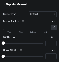
Seprator General Style
In Seprator General tab, You can manage Border and It’s Radius.
And for Normal and Hover, You can manage It’s Width.
Description General Style
In Description General tab, You can manage Text Alignment, Padding, Margin and It’s Typography.
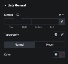
Lists General Style
In Lists General tab, You can manage Margin and It’s Typography.
Also, Manage Color for Normal and Hover.
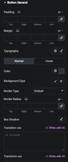
Button General Style
In Button General tab, You can manage Padding, Margin and It’s Typography.
Also, Manage Color, Background, Border, Box Shadow, Transition and Transform CSS for Normal and Hover.
Close Button Style
In Close Button tab, You can manage Size of Button.
Also, Manage Color, Background, Border and Box Shadow for Normal and Hover.
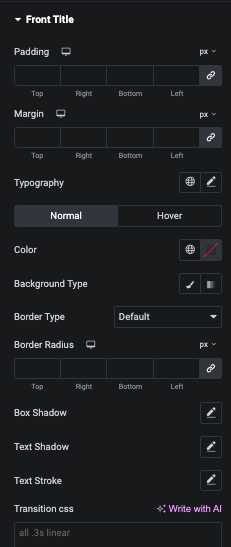
Front Title Style
In Front Title tab, You can manage Padding, Margin and It’s Typography.
Front Seprator Style
In Front Seprator General tab, You can manage Border and It’s Radius.
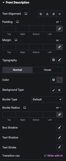
Front Description Style
In Front Description tab, You can manage Text Alignment, Padding, Margin and It’s Typography.
Front Lists Style
In Front Lists tab, You can manage Margin and It’s Typography.
Front Button Style
In Front Button tab, You can manage Padding, Margin and It’s Typography.
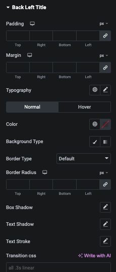
Back Left Title Style
In Back Left Title tab, You can manage Padding, Margin and It’s Typography.
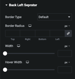
Back Left Seprator Style
In Back Left Seprator General tab, You can manage Border and It’s Radius.
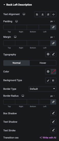
Back Left Description Style
In Back Left Description tab, You can manage Text Alignment, Padding, Margin and It’s Typography.
Back Left Lists Style
In Back Left Lists tab, You can manage Margin and It’s Typography.
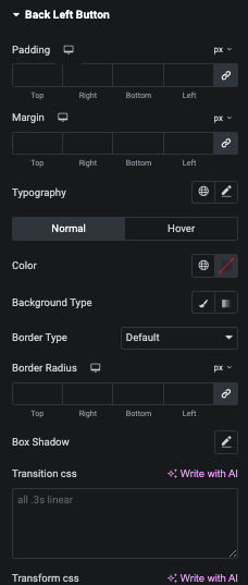
Back Left Button Style
In Back Left Button tab, You can manage Padding, Margin and It’s Typography.
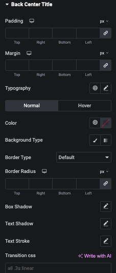
Back Center Title Style
In Back Center Title tab, You can manage Padding, Margin and It’s Typography.
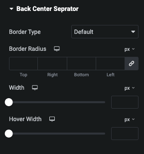
Back Center Seprator Style
In Back Center Seprator General tab, You can manage Border and It’s Radius.
Back Center Description Style
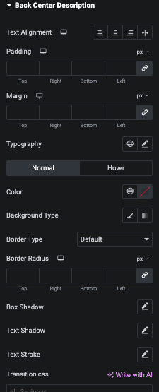
In Back Center Description tab, You can manage Text Alignment, Padding, Margin and It’s Typography.
Back Center Lists Style
In Back Center Lists tab, You can manage Margin and It’s Typography.
Back Center Button Style
In Back Center Button tab, You can manage Padding, Margin and It’s Typography.
Back Right Title Style
In Back Right Title tab, You can manage Padding, Margin and It’s Typography.
Back Right Seprator Style
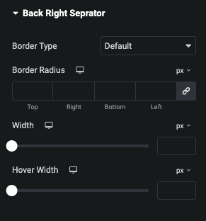
In Back Right Seprator General tab, You can manage Border and It’s Radius.
Back Right Description Style
In Back Right Description tab, You can manage Text Alignment, Padding, Margin and It’s Typography.
Back Right Lists Style
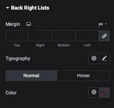
In Back Right Lists tab, You can manage Margin and It’s Typography.
Back Right Button Style
In Back Right Button tab, You can manage Padding, Margin and It’s Typography.


