Info Circle Widget Tutorial
Essential Classy Tab from Dashboad -> Widgets then enable Info Circle

Now Drag and Drop Info Circle widget

Info Circle Repeater

In Repeater, We have Icon and Image Selection options

You can manage Repeater Wise Styling like. Color and Background

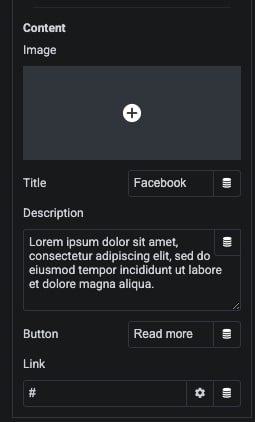
In Conent We have Image, Title, Description and Button options

Using Circle Size, You can manage Height-Width

Select Which Slide, You want active

Manage Title Tag

We have Click and Hover Trigger options

You can Set Autoplay and Manage Duration of Autoplay

Also, We have Circular Animation with On Hover Pause options

For Dots, We have Hover/Active Scale Animation options

Info Circle Style Tabs

Circle Info – Style Tab
In this tab, You can manage Icon Size and It’s color for Normal and Hover/Active State.

Circle Image – Style Tab
In this tab, You can manage Padding, Width and Height and It’s Background color, Border, Shadow, Transition and Trnform CSS for Normal and Hover/Active State.

Circle Icon/Image – Style Tab
In this tab, You can manage Padding and It’s Background color, Border, Shadow, Transition and Trnform CSS for Normal and Hover/Active State.

Image Content – Style Tab
In this tab, You can manage Padding, Margin, Width and Height and It’s Background color, Border, Shadow, Transition and Trnform CSS for Normal and Hover State.

Title Content – Style Tab
In this tab, You can manage Padding, Margin and Typography.
Also, We have Color, Background color, Border, Shadow, Transition and Trnform CSS for Normal and Hover State.

Description Content – Style Tab
In this tab, You can manage Padding, Margin and Typography. Also, We have Color, Background color, Border, Shadow, Transition and Trnform CSS for Normal and Hover State.

Button Content – Style Tab
In this tab, You can manage Padding, Margin and Typography options. Also, We have Color, Background color, Border, Shadow, Transition and Trnform CSS for Normal and Hover State.

Content Box – Style Tab
In Scale Animation, We have Special Effect for Hightlight content.
In this tab, You can manage Padding, Width and Height. Also, You can manage Background color, Border and Shadow for Normal and Hover State.

Circle Box – Style Tab
In this tab, You can manage Background color, Border and Shadow for Normal and Hover State.
