Essential Classy Tab from Dashboad -> Widgets then enable Info Card Grid Widget
Now Drag and Drop Info Card Grid widget
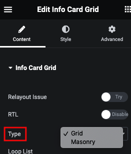
Manage RTL
Layout type Grid/Masonry
Info Card Grid Repeater
Here, You can manage Width, Height and Alignment
Manage Column with Gap
Info Card 3D Style Tab
Normal Image Style Tab
In this tab, You can manage Border and It’s Radius. Additionaly, You can manage Filter CSS, Box Shadow and Transition for Normal and Hover.
Hover Image Style Tab
Here you can manage Transform of Layout using CSS Editor.
Content Box Style Tab
In Content box tab, You can manage Padding and Bottom Offset of Info Card.
And For Normal and Hover, YOu can Manage Transform CSS with Editor.
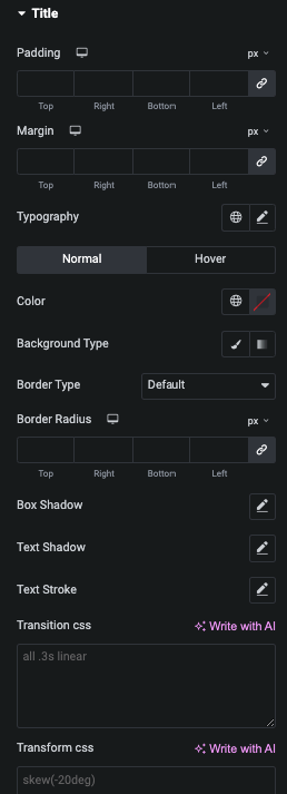
Title Style Tab
In this TItle tab, You can manage Padding, Margin and It’s Typography.
And for Normal and Hover, You can manage Color, Background, Border, Box Shadow, Text Shadow, Text Stroke, Transition and Transform.
Sub Title Style Tab
In this Sub TItle tab, You can manage Padding, Margin and It’s Typography.
Description Style Tab
In this Description tab, You can manage Padding, Margin and It’s Typography.


