Repeater : Backgroun Main Image, Icon/Image as Source, Title with Link, Content and Button
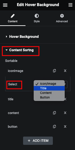
Content Sorting
Content Animation
Content Visibility based on Opacity
Style Tab
Icon
here in Icon, You can mange Padding, Margin and Icon Size.
And for Normal and Hover, You can manage Color, Background, Border and Box Shadow.
Image
here in Image, You can mange Padding, Margin and Image Size.
And for Normal and Hover, You can manage Background, Border and Box Shadow.
Title
here in Title, You can mange Padding, Margin and Typography.
Description
here in Description, You can mange Padding, Margin, Word Break(Keep all/Break all), Alignment, Max. Width and Typography.
Button
here in Button, You can mange Padding, Margin and Typography.
Box
here in Box, You can manage Overlay Color, Blur and Loop Min. Height.


