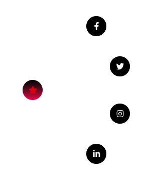
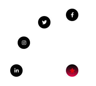
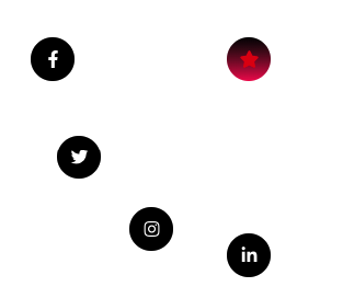
10+ Direction Option.
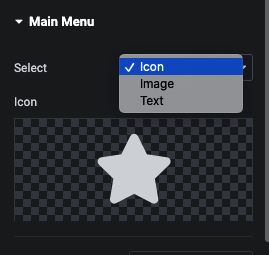
Main Menu
Here you can manage Trigger on Click or Hover based.
You can set Position as Absolute of Main Icon and Set It’s Offset.
You can set Position as Fixed of Main Icon and Set It’s Offset.
Additionaly manage Transform Effect on Main Menu Hover.
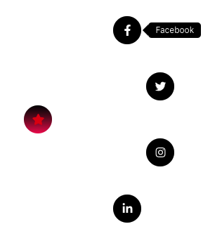
Submenu option of Circle Menu
Here you can use Icon, Image or Text.
Additionaly in Url, We have URL, Email(mailto), Phone(tel).
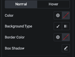
And for Styling, You can manage Color, Background, Border and Shadow in Repeater for Each submenu.
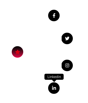
Additionaly We have Tooltip option.
You can manage Tooltip Arrow Postion.
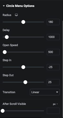
In Circle Menu Options, You can manage Circle Radius, Delay, Open Speed, Step In/Out and It’s Transition.
In Circle Menu Options, We have Offset Option for Circle Menu Visible. Using this option you circle menu visible after X Scroll.
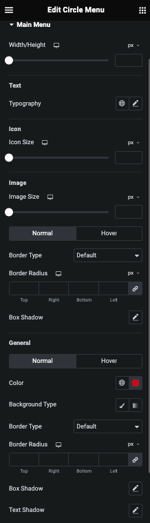
Main Menu Style Tab
In this tab, You can manage Width/Height of Main Menu.
For Text, You can manage Typography.
For Icon, You can manage Size.
And For Image, You can manage Image Size and It’s Border and Shadow for Normal and Hover.
For General Styling, You can manage Color, Background, Border, Shadow and Text Shadow for Normal and Hover.
Sub Menu Style Tab
Tooltip Style Tab
In this tab, You can manage Tooltip Visibility Enable/Disable for Mobile Device.
Here you can manage Padding and It’s Typography.
Additionaly, You can styling Color, Background, Border and It’s Shadow.


