WPForms Widget Tutorial


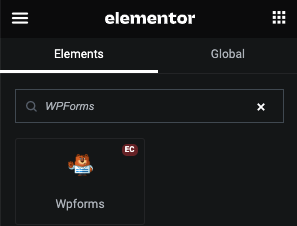
Select Form

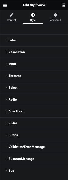
WPForms Styling

Label
In this tab, You can manage Padding, Margin, Typography, Color, background, Border, Box Shadow and Text Shadow.
Required
For Required sign, You can manage Size and It’s Color.
Description
In this tab, You can manage Padding, Margin, Typography, Color, background, Border, Box Shadow and Text Shadow.
Input
In this tab, You can manage Padding, Typography and Placeholder Color.
And for Normal and Focus, You can manage Color, Background, Border, Box Shadow and Text Shadow.
Text Area
In this tab, You can manage Padding, Height, Typography and Placeholder Color.
And for Normal and Focus, You can manage Color, Background, Border, Box Shadow and Text Shadow.
Select
In this tab, You can manage Padding, Typography, Color, Option Color, Background, Border and Box Shadow.
Radio
In this tab, You can manage Padding, Margin and Typography.
And for Checked and Unchecked, You can manage Color, Background, Border and Box Shadow.
Checkbox
In this tab, You can manage Padding, Margin and Typography.
And for Checked and Unchecked, You can manage Color, Icon Color, Background, Border and Box Shadow.
Slider
In this tab, You can manage Range and Dot Color.
Button
In this tab, You can manage Padding, Margin and Typography.
And for Normal and Hover, You can manage Color, Background, Border and Box Shadow.
Validation/Error Message
In this tab, You can manage Typography and Color.
Error Highlight
For error highlight, You can manage Border styling.
Success Message
In this tab, You can manage Padding, Margin, Typography, Color, background, Border and Box Shadow.
Box
In this tab, You can manage Padding and Margin.
And for Normal and Hover, You can manage Background, Border and Box Shadow.